Pages


Thursday, June 7, 2012

Exhibit for a Wonder-Room


Moth Masks, acrylic on papier-mâché masks - a work in progress. Individual masks: (H) 22.5 x  (W) 18 x  (D) 11 cm. Photograph by Tim Gresham 

This ongoing series of painted objects is one of several projects that, when combined, are intended to evoke a Wunderkammer, or ‘wonder-room’.

The work also draws from my personal mythology, primarily the fairy tale The Story of the Moth Masks.

A perennial inspiration is the enigmatic imagery of Surrealist artist René Magritte, whose oeuvre also encompassed painted objects. He first began painting on bottles such as those pictured here in the 1940s, which skilfully incorporate the technique of trompe l’oeil. At present, I’m reading Magritte A to Z (Tate Publishing, 2011, edited by Christoph Grunenberg and Darren Pih.) It has already become a key text. I very much share Magritte’s continuing fascination with notions of the double, metamorphosis, anonymity, disguise, the fictional character Fantômas and much else besides. The book has reminded me of how fundamental Magritte’s imagery and ideas are to my own work, perhaps more than those of any other artist.

Pictured left: Painted bottles by René Magritte, 1959

Tuesday, May 22, 2012

Ballarat Insects and Arachnids


The ever-evolving Myth-entomology project began in 2007. During that time I’ve steadily amassed a mountain of reference material on insects and arachnids, principally in books and journals, including the excellent Australian Geographic.  I’ve also photographed a great many examples (both living and preserved) from the extensive collections held in the Melbourne Museum, the Natural History Museums of London, New York, Berlin (see detail left) and other institutions.

Since we’ve been spending more time at Ballarat, however, I’ve been granted direct access to some wonderful free-range specimens. Better yet, I haven’t had to look very much further than my own backyard. 

The following photographs were taken in Ballarat over the last twelve months.


Images from top:

Common Rose Swallowtail Winged Woman, 2012, pencil (work in progress)
Installation view, Natural History Museum of Berlin, November 2011
Cricket
Grasshopper
Junonia villida butterfly
Nectarine blossoms with bees
Huge, exquisitely coloured specimen, possibly from the blowfly family
Orb Weaver, AKA Wheel Weaver spider
An example of the Orb Weaver's breathtaking spinning, weaving and engineering skills

Friday, May 11, 2012

Facelifts Part 2

Part of the first floor of our place at Abbotsford served as my partner Shane Jones’s studio for several years, while I worked on the ground floor. When I took a studio in the Melbourne CBD in late 2007, Shane decided to shift to my old workspace, where he found he could better control the light. The walls in the upstairs area remained hung with his artwork. It looked great, so there was no reason to move it. But when I recently set up in his previous space, I felt a little like a squatter. Shortly after my last post, we spent a solid day hanging a substantial amount of my work on the walls and transferring Shane’s paintings to the walls of his studio below. (At this point, I must shamefacedly confess he’s still storing some stuff from my former occupancy in his area. In my defence, there’s nowhere else to put it, at least until the Ballarat studio is finished.) On balance, the cupboard in my studio contains Shane’s extensive shell collection for much the same reason.

Some pictures by Shane and other artists, including Rona Green and Clare Humphries, slightly overlap my new studio (top left and left of the venetian blind in the photograph directly below.) The remaining wall space of our first floor is covered almost entirely with the works of numerous artists, in the mother of all salon hangs. You can get mighty tired of looking at your own work all day, so I’m grateful to have them all as muses.


Meanwhile, the territory of the atelier is certainly more distinctly marked, and my newly installed work (from the ongoing Myth-entomology series) should be a helpful point of disembarkation for current projects.


Photograph second from top:

Upper LHS: Painting by Shane Jones of my hands at work on the
linocut Rose Tattoos (1996). Next to it is a poster of Portrait of the 
Journalist Sylvia von Harden by Otto Dix (1926). I fell in love with the
original painting at first sighting in the Pompidou Centre in Paris in
1993. It's still one of my favourite pictures in all the world. 

Third and fourth photographs from top:

Studio views including Moth Masks and The Enchanted Hair Ornaments 
linocuts.

Wednesday, May 2, 2012

Facelifts

As all but the most deplorably inattentive followers of this blog will notice, it has had a major facelift. For the information of first-time visitors, it formerly comprised a black background overlaid with white and red text. Although I must confess to some nostalgia for the more immediate visual impact of the previous design, I was increasingly concerned that it was overpowering the general content, making information harder to locate and absorb.

Since its inception in 2008, the blog has been more than just somewhere to post information about exhibitions and other related events. It has increasingly become an extension of my practice, a place to collect my thoughts, share some of my interests and road-test new work and ideas. As the amount of information on the blog accumulated, I felt it needed to be made easier to read and navigate. It’s still being tweaked (I’m a terminal tweaker) but think it’s nearly there, and hope you do too.

If the blog partly serves as a virtual studio, my actual Melbourne studio has also been undergoing changes and is similarly in the process of being fine-tuned. After relinquishing my workspace in central Melbourne in 2011 (see blog post April 7, 2011) I set up in an idiosyncratic, but somewhat cave-like area of our warehouse apartment in Abbotsford. It soon proved to be way too small and dark. After a considerable amount of strategic planning and rearrangement, I’m now established upstairs in a lighter, airier, more private and infinitely more practicable space. Open-plan buildings have their benefits, flexibility being one of them. But they can present real challenges, especially when it comes to establishing boundaries between domestic and work areas. As an added bonus, our whole apartment feels more spacious, liveable and functional than it’s been since we moved here in 1998 - although it too is a constant work in progress.


Above, from top:

Partition wall of studio

Studio view. The ceramic statuette on the cupboard, top left is by David Pearson. On the far wall is a reproduction of Melody (Musica) c. 1890-1902 by Kate Elizabeth Bunce. To its right is my prized collection of (mostly) vintage combs and hairpins.

Wednesday, April 25, 2012

Rick Amor Drawing Prize Finalist


Two-Faced Woman, 2012, pencil and pastel, 75 x 56 cm 
Photograph by Shane Jones

My drawing Two-Faced Woman is one of 72 works shortlisted for the Rick Amor Drawing Prize 2012. I understand that there were over 600 submissions this year, which is surely a positive sign that drawing is alive and well and kicking.

Rick Amor is quoted on the invitation: “I hope that this prize gives people one more reason to keep drawing on paper…the most direct and intimate expression of an artist’s sensibility”

The opening event is on Friday 27 April at 6 pm, with formalities commencing at 6.30 pm.

The exhibition will run from Saturday 28 April – Sunday 24 June.

Art Gallery of Ballarat
40 Lydiard Street Nth
Ballarat
Victoria 3350
Telephone: 03 5320 5858

Thursday, April 19, 2012

MLC Contemporary Art Collection


An exhibition showcasing a large selection of the MLC Contemporary Art Collection will be launched next Tuesday. In conjunction with the event, I've been invited to give an informal talk about my works in the collection, my work practice and recent artwork.

The invitation is reproduced above. Images L to R: Trap, 2005, Funambulist, 2005, Crowning Glory 1,
2005, all acrylic on wood. Collection: MLC Melbourne.

Opening 7 pm Tuesday April 24
Common Ground Exhibition Space and
James Tatoulis Auditorium
207 Barkers Road
Kew

Refreshments provided by
MLC Friends of Art
foa@mlc.vic.edu.au

The exhibition runs until May 16.

Wednesday, April 11, 2012

'behind beauty's masks' by Inga Walton


Campylotes desgonsini Moth Mask, 2007, oil pastel, 112x 76 cm 
Photograph by Viki Petherbridge


Issue 10 of the journal etchings, titled the feminine, features an article on my work by Inga Walton, by far the most extensive that has been written to date.

Inga has written about my work twice before, in 2004 (1) and 2009 (2). She is a superb writer, who is not only remarkably conversant with and genuinely enthusiastic about the work, but also ‘gets’ it, which is enormously gratifying for any artist. She worked particularly long and hard on this piece, unearthing some entirely new ground along the way.

On this occasion, I had some small involvement in the process, in that Inga sent me a list of thought-provoking questions, many of which I’ve ever been asked before. For the most part, it’s a relatively straightforward matter for artists to discuss the basis of our ideas and influences. But at times, even to us, it feels as if some ideas are simply plucked from the air, and this can be far more difficult to articulate. Her questions sometimes required some serious delving on my part, uncovering personal memories that I’d never fully thought about in connection with my work. I learned that some of its sources go back much further than I’d realized - in fact I hadn’t even recognized them as such.

An excerpt from Inga Walton’s behind beauty’s masks: works by Deborah Klein can be read HERE.

Etchings is published by Ilura Press. Issue 10 will be launched on April 19 at Readings Bookshop, 112 Acland Street, St Kilda from 6.30-8.30 pm. Full details are posted on the Ilura Press Website.


(1) Feminine Mystique by Inga Walton, Independent Arts Review, Issue 20, December 2004 - January 2005, Summer Edition

(2) Inga Walton’s article The Elusive Feminine: Works by Deborah Klein (eyeline contemporary visual arts, number 67, 2009) is reproduced on the Articles and Reviews page of my website. To read it in pdf format, click HERE.

Tuesday, April 3, 2012

Dorothy Parker, Part 2


This second of a two-part post focusing on Dorothy Parker's writings that have directly and indirectly inspired my own work features three more of her verses and the opening paragraphs of the story Sentiment. Unfortunately, it’s too long to reproduce entirely (including its bittersweet ending). I hope that those not familiar with the tale will be encouraged to seek it out in book form. For me, Parker’s short stories are her finest literary achievements. Several of the most memorable, including Sentiment, are interior monologues.

To sample another of her stories that take this form - and for a complete contrast in mood - revisit Dorothy Parker’s  The Waltz, Blog Post Sunday March 8, 2009, by clicking HERE.

A word to those wanting to make a closer acquaintance with the work, with the intention of forming a more lasting relationship: ultimately,  her words are best experienced by way of the privacy and intimacy of the printed page, not on a computer screen.


 Sentiment (excerpt)

Oh, anywhere, driver, anywhere – it doesn’t matter. Just keep driving.

It’s better here in this taxi than it was walking. It’s no good my trying to walk. There is always a glimpse through the crowd of someone who looks like him – someone with his swing of the shoulders, his slant of the hat. And I think it’s he, I think he’s come back. And my heart goes to scalding water, and the buildings sway and bend above me. No, it’s better to be here. But I wish the driver would go fast, so fast that that people walking by would be a long gray blur, and I could see no swinging shoulder, no slanted hat. It’s bad stopping still in the traffic like this. People pass too slowly, too clearly, and always the next one might be  - No, of course it couldn’t be. I know that. Of  course I know it. But it might be, it might.

And people can look in and see me, here. They can see if I cry. Oh, let them – it doesn’t matter. Let them look and be damned to them.

Yes, you look at me. Look and look and look, you poor, queer tired woman. It’s a pretty hat, isn’t it? It’s meant to be looked at. That’s why it’s so big and red and new, that’s why it has these great soft poppies on it. Your poor hat is all weary and done with. It looks like a dead cat, a cat that was run over and pushed out of the way against the curbstone. Don’t you wish you were I and could have a new hat whenever you pleased? You could walk fast, couldn’t you, and hold your head high and raise your feet from the pavement if you were on your way to a new hat, a beautiful hat, a hat that cost more than ever you had? Only I hope you wouldn’t choose one like mine. For red is mourning, you know. Scarlet red for a love that’s dead. Didn’t you know that?……


Inscription for the Ceiling of a Bedroom

Daily dawns another day;

I must up, to make my way.

Though I dress and drink and eat,

Move my fingers and my feet,

Learn a little, here and there,

Weep and laugh and sweat and swear,

Hear a song, or watch a stage,

Leave some words upon a page,

Claim a foe, or hail a friend-

Bed awaits me at the end.

Though I go in pride and strength,

I'll come back to bed at length.

Though I walk in blinded woe,

Back to bed I'm bound to go.

High my heart, or bowed my head,

All my days but lead to bed.

Up, and out, and on; and then

Ever back to bed again,

Summer, Winter, Spring, and Fall -
I'm a fool to rise at all!


Interior

Her mind lives in a quiet room,
A narrow room, and tall,
With pretty lamps to quench the gloom
And mottoes on the wall.

There all the things are waxen neat,
And set in decorous lines,
And there are posies, round and sweet,
And little, straightened vines.

Her mind lives tidily, apart
From cold and noise and pain,
And bolts the door against her heart,
Out wailing in the rain.


Resume

Razors pain you;
Rivers are damp;
Acids stain you;
And drugs cause cramp;
Guns aren't lawful;
Nooses give;
Gas smells awful;
You might as well live.


The fragment from Sentiment and the poems reproduced above originally appeared together in The Portable Dorothy Parker, as arranged by Mrs. Parker in 1944. An expanded version is in print as a Penguin Classics Deluxe Edition (paperback) first published in 2006. It’s a handsome volume, although to put it mildly, I’m not an admirer of the cover illustrations, particularly those on the inside back cover.

There are numerous online links to Dorothy Parker’s printed works. One of them is HERE. Along with Oscar Wilde, Dorothy Parker is arguably one of the most quoted authors of all time. To discover her point of view, see Oscar Wilde according to Dorothy Parker on Moth Woman Press HERE.
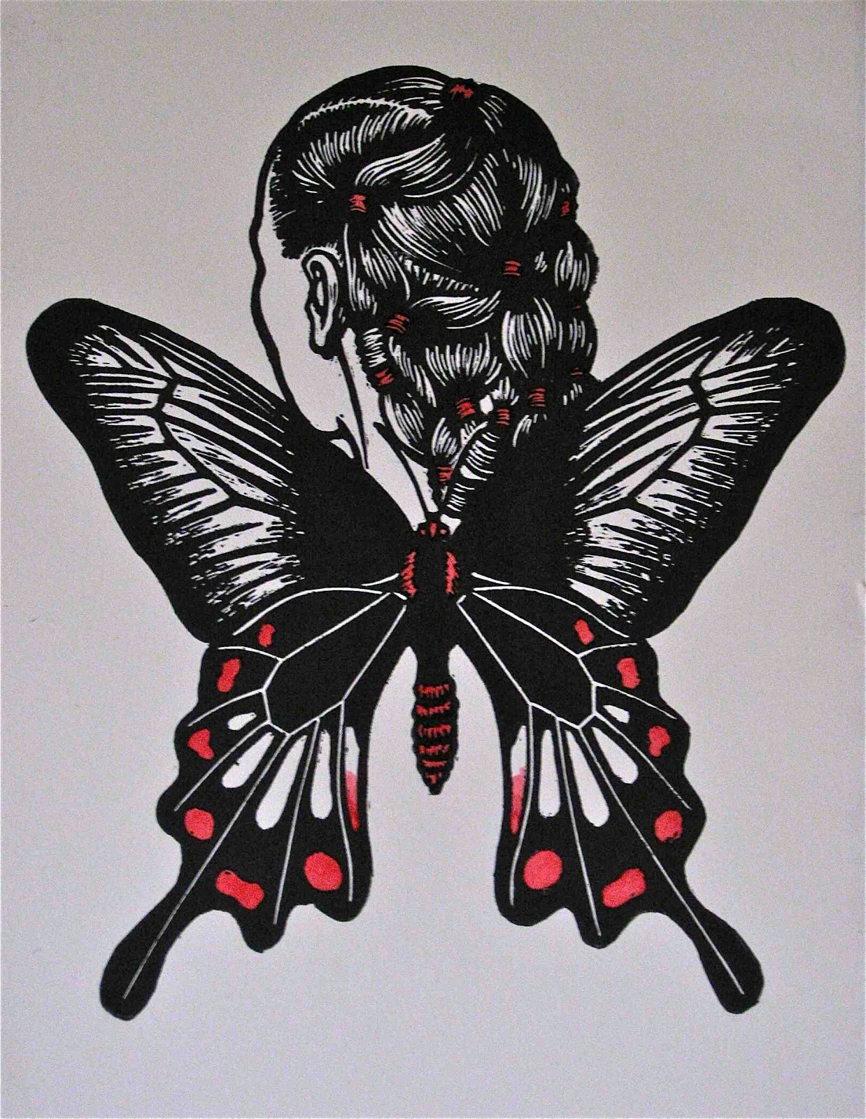
Images from top:

Dorothy Parker (photograph by Associate Press, 1941)

Reflections, 1996, linocut, chine colle. Collection: Silk Cut Foundation

Her Mind Lives in a Quiet Room, 1994, woodcut

The Little Hours, 1994, woodcut (detail)

Dorothy Parker, 1994, woodcut, chine colle

Thursday, March 29, 2012

Dorothy Parker, Part 1


As some visitors to this blog may be aware, I’m a longtime admirer of the poetry and prose of Dorothy Parker, which for me - and a great many others, I’m sure - gain in resonance with every passing year. Alternatively comedic and tragic, cruel and kind, cynical and sentimental, bitter and sweet, despairing and hopeful, they are filled with contradictions – but almost invariably razor-sharp. In one form or another, her verse and short stories have infiltrated my own work many times, both directly and indirectly. Here are some examples:


One Perfect Rose

A single flow'r he sent me, since we met.
All tenderly his messenger he chose;
Deep-hearted, pure, with scented dew still wet --
One perfect rose.

I knew the language of the floweret:
`My fragile leaves,' it said, `his heart enclose'.
Love long has taken for his amulet
One perfect rose.

Why is it no one ever sent me yet
One perfect limousine, do you suppose?
Ah no, it's always just my luck to get
One perfect rose.


Sanctuary

My land is bare of chattering folk;

The clouds are low along the ridges,

And sweet's the air with curly smoke

From all my burning bridges.


Words of Comfort to be Scratched on a Mirror

Helen of Troy had a wandering glance;
Sappho's restriction was only the sky;
Ninon was ever the chatter of France;
But oh, what a good girl am I!


Bric-a-Brac

Little things that no one needs―
Little things to joke about―
Little landscapes, done in beads.
Little morals, woven out,
Little wreaths of gilded grass,
Little brigs of whittled oak
Bottled painfully in glass;
These are made by lonely folk.

Lonely folk have lines of days
Long and faltering and thin;
Therefore—little wax bouquets,
Prayers cut upon a pin,
Little maps of pinkish lands,
Little charts of curly seas,
Little plats of linen strands,
Little verses, such as these.

Images from top:

Dorothy Parker, 1939 (Culver Pictures)
Woman on a Bridge, 1996, linocut, hand coloured, 46 x 30 cm
All My Burning Bridges, 1996, linocut, 46 x 31 xm
Powder Room, 1996, colour linocut, 61 x 46 cm
Untitled, 1995, woodcut with chine colle, 61 x 46 cm

Thursday, March 22, 2012

More Tattooed Text


Love Letters, 1997, colour linocut, 46 x 30 cm. 
Collection National Gallery of Australia

Continuing with the subject of Tattooed Women Past and Present, last week I learned from Sarina Noordhuis-Fairfax, Curator, Australian Prints & Drawings at the National Gallery of Australia, that she has just curated my linocut Love Letters (1997) into a small works on paper show in the NGA’s Australian Art Galleries. The exhibition is loosely themed around the idea of ‘mail art’. Coincidentally, this image also incorporates text (see previous blog post Lost in Translation). Love Letters is one of the few colour linocuts I’ve made. Its theme is eternal: most of us are fools for love. It seems to me that only one thing has changed. On the evidence of the stamp that partly blinds our love-struck heroine, note how much the cost of postage has risen since 1997.

The exhibition also features work by Mike Parr, Richard Tipping, Eugene Carchesio, Pete Spence, Bob Peacock, Noel Hutchison, Brian Thomson and Ian Milliss. It is scheduled to run for approximately 6 months.

The National Gallery of Australia
Parkes Place
Canberra ACT 2600
General information +61 2 6340 6501
Open Daily 10 am - 5 pm (closed Christmas Day)

Thursday, March 15, 2012

Lost in Translation

Pictured above: Tattooed Texts, 2012, pencil, 35 x 25 cm. Photograph by Tim Gresham

Pictured above is a recently completed work that will shortly be heading for London. It is one of eighty-seven drawings by Australian artists that have been included in the forthcoming exhibition Contemporary Australian Drawing 2: Drawing as notation, text and discovery. The show will run from 23 March – 5 April. It is timed to coincide with the Drawing Out conference at the University of the Arts, London, on 28-30 March 2012.

Curator Dr. Irene Barberis invited artists to respond to either (or both) of these assertions from writers Michel Butor and Serge Tisseron: 

All writing is drawing; and

The space of writing: what does this mean?

My drawing is a response to the first quote.

The image evolved in part from the tattooed women who debuted in my work in the mid 1990s, and have recently made a comeback in the current fairground imagery. An equally significant point of departure for the composition was Man Ray’s iconic Rayograph Le Violin d’Ingres, 1924 (see photograph below, right hand side).

Individual texts are inscribed on the subject’s back in a multitude of languages, including German, Chinese, Welsh, Celtic, Russian, Urdu, Arabic and Japanese. They each denote a common tattoo motif, for example, a rose, a dragonfly, a spider in a web, an eagle, a tiger, barbed wire, an anchor and a sailing ship. In their original pictorial form they would have encompassed a collection of graphic, instantly recognizable images that could be universally read. Now, unless the viewer is prodigiously multi-lingual, most, if not all, are lost in translation.

Pictured above: finished work surrounded by assorted reference materials 
and preparatory drawings

Wednesday, March 7, 2012

Freak of Nature in Colorado

Freak of Nature exhibition curator and coordinator Rona Green recently forwarded the following installation views, taken in January at the King Family Space, University of Colorado in Boulder, Colorado. The photographs are courtesy of Melanie Yazzie, Associate Professor of Art, University of Colorado. Freak of Nature was launched last September at Switchback Gallery, Monash University, Gippsland, as part of IMPACT 7, Monash University’s International Print Symposium. (See Blog Post May 11 2011 HERE.)

Participating artists were:

Daniel Allegrucci, Neal Ambrose-Smith, Ampersand Duck (Caren Florance), Rosalind Atkins, Sam Broad, Heather Bryant, Jazmina Cininas, Elizabeth Cole, Paul Compton, Filomena Coppola, Marian Crawford, Kyla Cresswell, Robert Dente, Vincent Drane, Di Ellis, Rodney Forbes, Stephen A Fredericks, Kaitlyn Gibson, Rona Green, Richard Harding, Gregory Harrison, John Ingleton, Simon Kaan, Deborah Klein, Elizabeth Klimek, Kelvin Mann, Michelle Martin, Ron McBurnie, Joshua Norton, George Pados, Janet Parker-Smith, Susan Purdy, John Ryrie, Jane Sampson, Annelise Scott, Matthew Searle, Heather Shimmen, Margaret Silverwood, Jaune Quick-To-See Smith, Neale Stratford, R.L. Tillman, Clayton Tremlett, Sheyne Tuffery, Deborah Williams, Fleur Williams, Melanie Yazzie and Kate Zizys.

 Associate Professor Melanie Yazzie pictured with Freak of Nature 
exhibition, University of Colorado, January 2012

Installation view (detail)

To discover more about individual artists and artworks, view the online exhibition catalogue on Rona Green’s website HERE.

Pictured top left: Red Bodied Swallowtail Winged Woman, 2011, linocut, hand coloured

Thursday, March 1, 2012

The Spider Woman

The suite of linocuts based on sideshow identities is an ongoing labour of love, with no end as yet in sight, mainly because I'm constantly juggling it with other projects. But encouraged by some positive response to the first Sideshows and Funfairs feature (see Blog Post February 11) I’ve decided to preview another work in progress from the series.

Step right up, folks, and meet The Spider Woman:

The Spider Woman, 2012, lino block

The Spider Girl has long been a permanent sideshow fixture, eventually becoming better known as ‘Spidora’. By 1917 several greedy showmen were offering to disclose the secret of the illusion for an extra 25 cents, despite a letter of complaint to Billboard magazine from showman James A. ‘Fingers’ Wallace demanding that the practice be stopped.

Yet Spidora flourished and continues as a sideshow attraction to this day. At New York’s Coney Island her background was revealed by the Barker: “Step right up folks, meet ‘Spidora’, the Spider Girl. Born with the head and face of a beautiful girl and the body of an ugly spider, she survives in total misery, for no man could love her.” The Barker explained that she lived off her earnings as a sideshow freak, that she ate flies and other insects. But the Spider Girl illusion frequently backfired when even some of the most gullible spectators recognized the same girl’s head atop other exotic creatures, such as The Human Butterfly and The Snake Girl.

The Spider Girl is living testament that human beings love to be fooled - even when confronted with one of the most obvious illusions of all time.

Unlike the unhappy Spidora, however, the Red Back Spider/Woman hybrid depicted above is no fake and is definitely not to be crossed. She has more in common with the non-arachnid arch villain as portrayed by Gale Sondergaard (one of my favourite actresses) in the Sherlock Holmes movie Spider Woman, 1944, dir. Roy William Neill, whom Holmes acknowledges is as cunning as Moriarty and as venomous as a spider. So popular was Sondergaard’s portrayal, it spawned a non-Sherlock Holmes ‘sequel,’ the horror movie The Spider Woman Strikes Back.

Yes, folks, feast your eyes on the Spider Woman - but beware she doesn’t feast on you.

For your further edification, here is a short visual history of the Spider Girl Sisterhood (although The Crying Spider by Odilon Redon (second from top) is of somewhat indeterminate gender).

Arachne in Hell by Gustave Dore, engraving
(from 1861 edition of Dante's Inferno

The Crying Spider, 1881, by Odilon Redon, charcoal


Spidora at Copperdollar. Visit her at Copperdollar's
extraordinary website HERE.

Friday, February 24, 2012

Berlin Retrospective #2: The Berlin Wall and The East Side Gallery

Fragments of the infamous Berlin Wall are scattered throughout Berlin. A sizeable portion of the wall  has been retained by architects Kohlhoff and Kohlhoff as part of the extraordinary Berlin Wall Memorial. In reality there were two walls, one some distance behind the other. It’s no small wonder that anyone managed to escape at all. There is a permanent outdoor exhibition that gives a chilling insight into what life was like in a divided Berlin, including a memorial wall which honours those who died during attempts to escape from the east side into the west. Also on the site is the Chapel of Reconciliation. Adjacent is an Information Centre that relates the history of the wall through photographic exhibitions and a series of short films. Directly across the road is the Documentation Centre, complete with a lookout tower. A climb to the top is highly recommended. To read more about the Berlin Wall Memorial, click HERE.


Near the centre of Berlin is the longest outdoor gallery in the world. The East Side Gallery is a 1.3km long section of the Berlin Wall on which artists have also acknowledged the Wall’s dark history – but, like the Berlin Wall Memorial, more than anything their works commemorate the extraordinary courage and endurance of the human spirit.